Woo – is it September already? It’s probably about time I did that blog thing, then!
For this month’s blog update, I thought I’d post a few pages from a new book I’m working on for Skinnyboy Studios, which goes by the title ‘America’s Kingdom.’
Written by Brian Hawkins and with art by Aris Gonzales, This is an ambitious little project, delving into ‘what if?’ territory. Itpresents an alternate history in which the USA is a monarchy, instead of a democracy, focusing (in issue #1, at least) on the troubles of a soon to be crowned king, as he faces down civil unrest and an impending marriage.
Here are the pages. As usual, I’ll say a bit underneath them about how I approached them.
Starting on a new book is always exciting for me, because it means I have an opportunity to use all the new lettering ideas and knowledge that I’ve amassed up to that point. Sometimes, I’ll learn a new trick, or have an idea halfway through the run of a book – and by then, I can’t really use it without upsetting the visual continuity of that book. So those ideas get held onto and saved for the next project. In short, this means that each new project benefits from things I learned on the last.
The first thing I noticed on reading the script for America’s Kingdom #1 was that the first few pages were very SFX heavy. This was a happy coincidence, as I’d been thinking before then that my SFX work needed a bit more life and variety. So it was that, for this #1 issue, I took the unusual step of budgeting a single night’s work to designing the SFX for the first scene of the book.
It’s sometimes said that SFX can show the measure of a letterer’s skill. It’s with this thought in mind that I’m always seeking to do something dynamic or interesting with them.
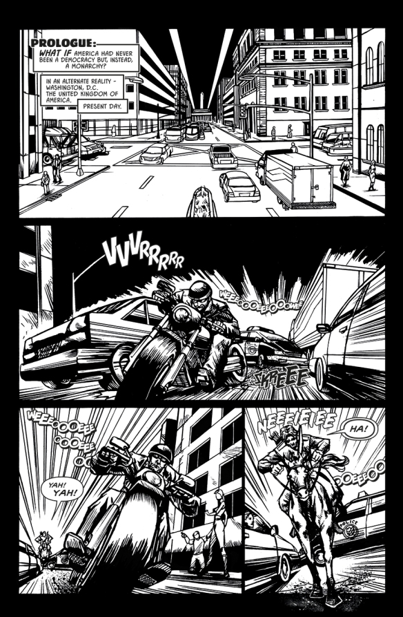
Taking a look at page 1, we’ve got an interesting mix of things to play with. There’s a motorcycle engine, police sirens and a neighing horse. I’ve tried to keep the font choices varied, so that different sounds are easily identifiable as coming from different sources.
Here’s how I approached the rendering of these sounds:
The font choices need to be varied, to make it clear that these different sounds are coming from different sources. So, with this in mind, I trawl through my font library and start looking for likely candidates. What adds to the challenge here is that America’s Kingdom is published in black and white, so I can’t use colour to differentiate things.
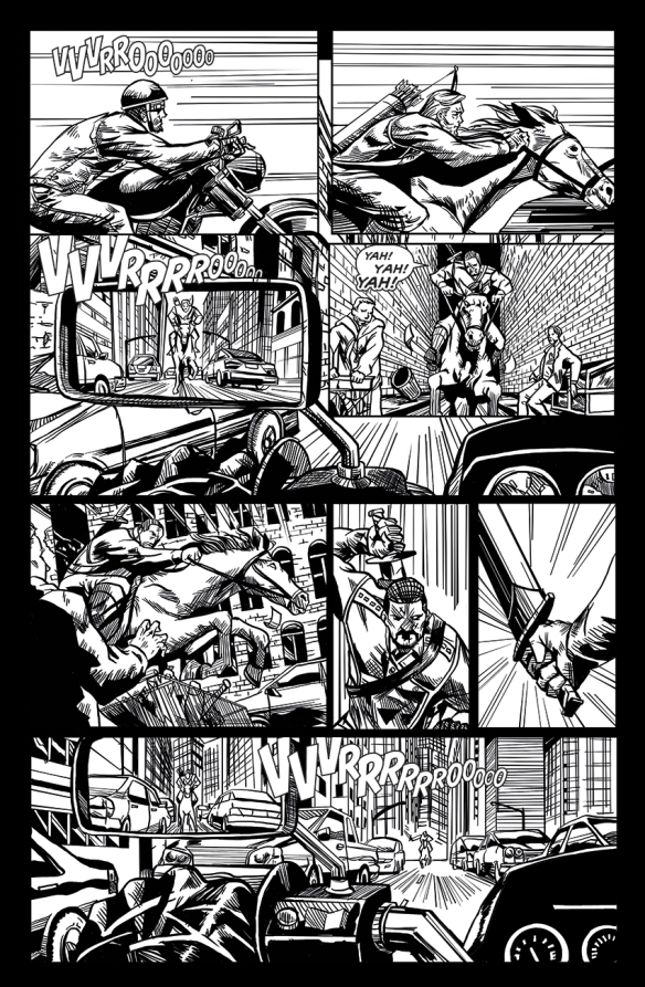
The font I’ve used for the motorcycle, the ‘vroooooooo’s that dominate these pages, is one that lends itself very well to altering the point size of different letters. This helps to sell the idea of a sound that isn’t at a constant level all the time – important for the sound of an engine that’s either zooming out of the panel toward us, or barrelling away from us. Notice how the letters get larger the closer they are to us, and smaller as they recede. This is my attempt to add a little ‘motion’ to the SFX, to accent the motion that Aris has so capably drawn in the panels.
For the police sirens, I was thinking of a more electronic, artificial sound. I’ve used a font that has a little more of a precision – rendered feel here, and changed up the point size of individual letters again – but this time, I’m doing it slightly differently. Notice that the point size rises and falls quite regularly, as opposed to the random resizing I used before for the motorcycle. This is all an attempt to create a different ‘sound’ on the page.
The horse was a real challenge, and it’s perhaps the one part of this page I feel could be better. I didn’t really want to use a speech balloon here, as the panel composition would have necessitated using a long tail which, however I drew it, was going to make things look cluttered. Hence, I opted for a floating SFX. My choice this time was a font with that ‘drawn with a brush’ look… but really wish there was a little more variety to it. I’ve helped it a bit with some bumping of the baseline and varied point sizes again. This, again, is the challenge – sometimes a font requires a lot of creative thinking to really get the best from it.
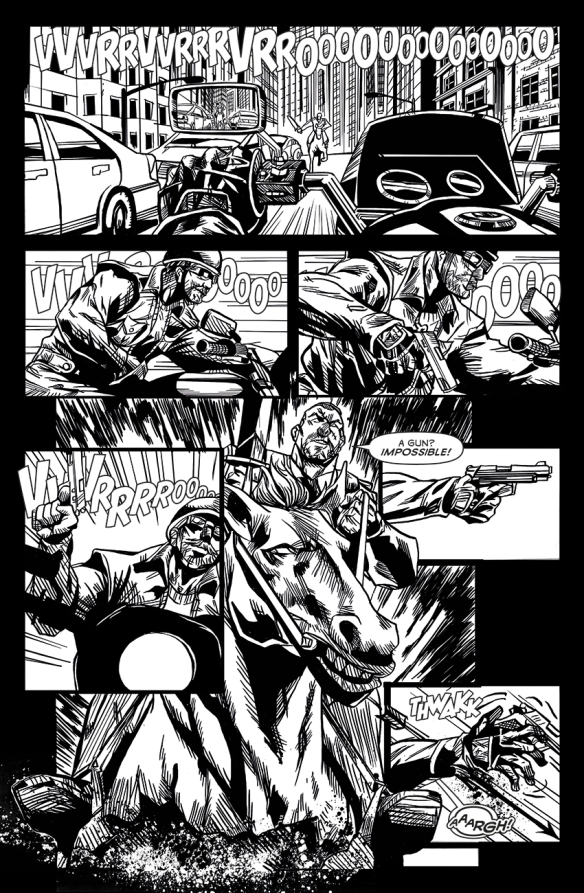
Elsewhere on these pages, I’ve had to add in some extra SFX – a screeching motorcycle tyre and the ‘THWAKK’ in the last panel on page 3. There’s a certain amount of ‘dealer’s choice’ when it comes to things like these SFX. I had to obviously make them stand apart from the more regulated SFX used everywhere else, so I fell back on a couple of typefaces that are favourites of mine. Blambot FX Pro does a LOT of this sort of heavy lifting in my work.
Page 3, I’m really proud of. I had a hard copy of this in my folio folder at the ICE 2014 convention, and it garnered a lot of praise. Several folks who saw it asked if I had hand lettered the first few panels! This to me is a HUGE compliment, as I’m always looking for ways to introduce a little more of the organic feel of pen and ink work into my pages. But that might be a topic for another entry!
The real task there was to keep that sense of motion from the first couple of pages, when the panels are drawn either from the side or head on. The idea of having a long SFX at the top of panel 1 seemed to add a nice degree of visual diversity here – important when you’re lettering essentially the same things across three pages.
Anyhow – there it is. A mini master class in SFX, and a peek at a very cool book! Please do go and check out the work that Brian and Aris have done. I can honestly say I’ve never worked on a comic like it.


