Hey-ho space cadets, starship troopers, wookies and facehuggers!
Here’s a peek at ‘Salvagers’, currently available from Hound Comics. This book is the combined effort of Bob Salley, George Acevedo and colourist DeSiKa, with a smattering of lettersauce from yours truly. It’s a sci-fi adventure following a salty crew of space brigands as they go about their adventures, ripping off space derelicts and getting into scrapes. Fun stuff!
The gig came about after Bob Sally and I communicated for a while on Facebook. A preview of the finished #1 issue had already been posted online, and I cheekily suggested that the lettering could be improved. Bob asked me some very intelligent questions about the practicalities and costs of having the book lettered professionally. Long story short, the question was popped to me “would you be willing and able to do it for us?” Naturally, being a starving freelancer, I said yes in a shot.
Bob and the team were interested in seeing how issue #1 would look with my lettering replacing the DIY job they’d done, partly for the sake of ensuring design consistency between that and issue #2, which was the first I had been properly slated to work on. This meant I had a golden opportunity to revamp the book’s lettering design from the ground up, and add something extra to the book.
After getting permission from the team, I thought it might be an eye opener to show the difference hiring an experienced letterer can make to a comic book. I’ve been waiting for an opportunity to do this for a few years now, as I’ve encountered a number of indie comics creators and hobbyists who seem to be of the opinion that quality lettering somehow isn’t an important. You just need to be able to read what’s in the balloons, right? Well, that approach will get you so far. But if you go the extra mile, you’ll add a whole extra level of polish to your product, and you’ll open up a lot of possibilities as regards communicating your story.
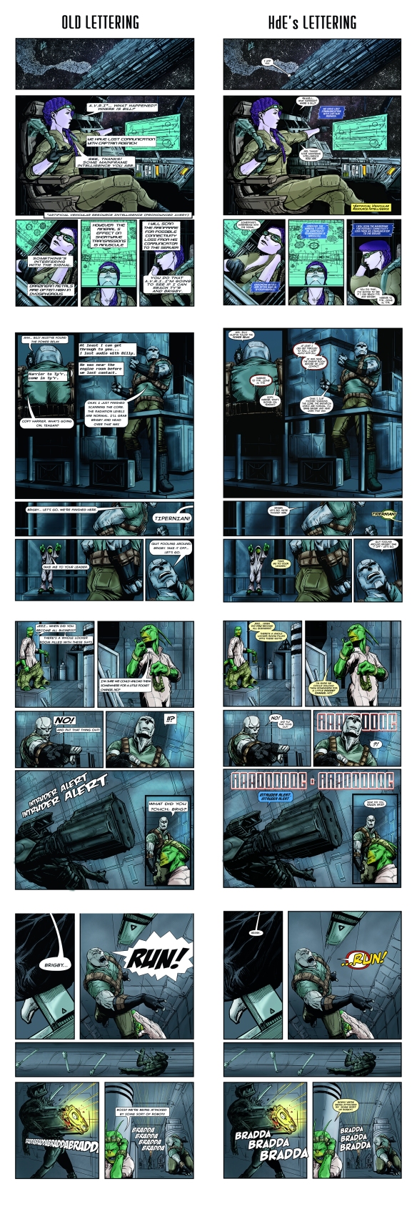
So, to illustrate – and I emphasize, I have Bob and George’s permission to do this – I’ve yanked a few pages from the first run of Salvagers #1 and placed them alongside my re-lettered pages as they appear in the remastered edition.
Here are four pages with Bob and George’s lettering applied. Alongside them are my relettered pages. You’ll hve to click on the image below and zoom in to view them at readable size. I think you’ll be surprised at how different the two versions are!
 Now, what Bob and George did is serviceable. It does the job of communicating the story, and I applaud anybody with the determination to get their project realised this far. I’ve certainly seen less elegant jobs on small press and indie books – and, it’s worth noting, the prevalence of poor lettering at that end of the market is what made me take the plunge and start lettering freelance.
What I appreciate far more, however, and it’s something that makes the Salvagers team a pleasure to work with, is that they see where this aspect of the book can be improved, and are willing to go the extra mile with it. For them, it meant entrusting their book’s lettering to an outsider. I know as much as anybody how this can fill a creator with trepidation!
So, the pressure was on to make sure I turned in a lettering job that was of higher quality, but also gave the guys what I firmly believe my clients deserve – value for money. I started looking for ways to add to the book’s aestehtic with the lettering, without over-egging it. This was a challenge, but it was also a lot of fun!
Mostly, the re-lettering of Salvagers #1 saw me correcting balloon placements and conventions. Certain balloons would benefit from being more clearly re-designed to look like radio balloons, for example, and I was able to give the ship’s computer, A.V.R.I., and the alien character Brigby their own unique ‘voices’. As soon as I start doing this sort of thing, theres a risk of diverting attention from the story and art onto the lettering, so a lot of careful judgement is required to prevent that from happening. Thankfully, the book lends itself well to cutting loose with more expressive lettering. It really is a joy to work on.
The rest of the team were (to my relief) happy with the re-design, so… mission accomplished! I hope you’ll make the effort to check out the finished product. I’m presently lettering issue #2, and it’s certainly shaping up to be a fun ride.
